User Interface designs have seen an exponential growth in terms of acceptance and relevance in the Software Development Life Cycle. With more than 576,000 websites made every single day, it’s becoming increasingly difficult for companies and brands who provide impeccable services to their customers to stand out and get discovered. Excellent work and skill is still of primal importance, but that alone wouldn’t cut it! Discoverability has become a big important step for the success of any brand; and strong, usable and user appealing UI designs started becoming the differentiating factor enabling brands to get discovered.
This created a niche in the market for skilled and amazing UI designers and with that emerged specific techniques and methodologies to approach UI design; creating UI design trends. Some design trends are widely accepted and become the new de facto for many software solutions, whereas some of them seem promising but don’t quite take off. Sure, adoption of these UI trends by the big tech giants give them the credibility and cement them as the new normal, but that alone doesn’t guarantee the success of a design trend.
One such great example of a design trend that looked promising but didn’t quite make the cut into the mainstream is Neumorphism UI. It was an innovative design philosophy that made it look like the buttons and UI elements were protruding from the background instead of being placed on top of it. It was a fresh new design concept with great hopes. However, some critical flaws such as the visibility of the subtleties on low resolution screen, not being usable enough for visually impaired users, poor distinguishing and highlighting factors for buttons and CTA among a myriad of other reasons made it fade away into oblivion.
That said, these are some of the most happening and popping UI trends for 2021

1. Glassmorphism
One of the most promising design trends of 2021 (and probably the years to come), Glassmorphism has a very clear trajectory on being one of the most influential design trends. One of the main contributing factors for this is the fact that both Apple and Microsoft have adopted it in their latest desktop operating systems. You know a trend is here to stay when two of the top tech giants have adopted it in the flagship products.
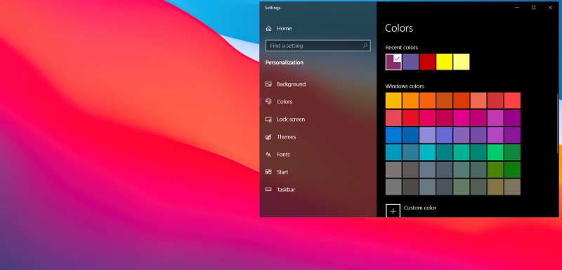
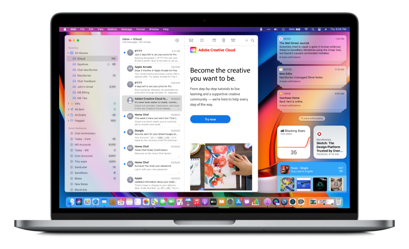
What is glassmorphism? What distinguishes it from other ‘normal’ designs? To differentiate that, it’s essential to describe the most defining characteristics of it, some of which are:
- Transparency, with a frosted glass effect
- Bright vivid colours and gradients to highlight the blurred regions
- A light border on the translucent objects
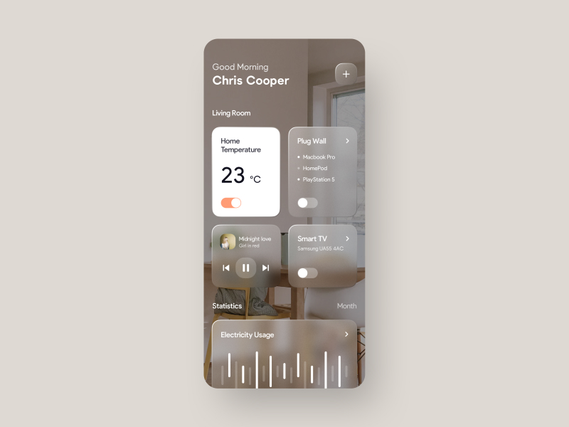
As is clear with the example given above, for Glassmorphism to work, there needs to be a background with vivid colours or in this case, a photo with multiple colours. It’s for such backgrounds that the feel of transparency, which is a unique factor of Glassmorphism, is most visible.
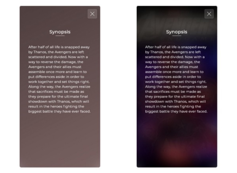
Glassmorphism makes it easy to give a sense of visual hierarchy to the design. The blurry transparent elements help the users to understand the hierarchy better. That said, Glassmorphism designs would be completely pointless if you have a non colourful background. A great example is given below:
2. Soft Coloured Gradients
Gradients? Is this the early 2000s? That’s what most designers thought when this principle re-gained a renewed traction in the recent years. Gradients aren’t new when it comes to UI or element design. Remember WordArts? Gradients have been living since long before that.
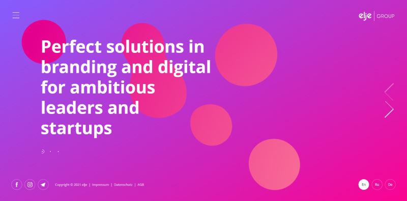
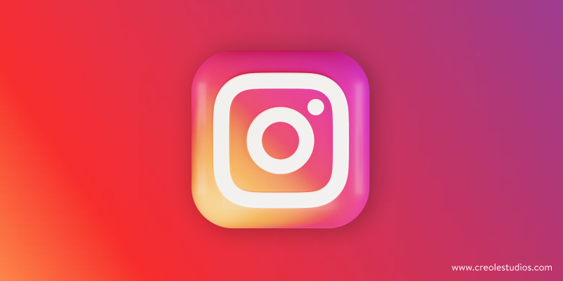
With big brands such as Instagram adopting a bold gradient design in their logo lately, more and more brands are trying their hands on this principle, making it one of the hottest UI design trends to watch for in 2021.
Gradients can help induce a lot of different emotions in your users’ minds, making your designs more appealing and hence your software solutions to be more usable. Gradients naturally direct humans to its focal point, allowing you to steer your users’ focus exactly where you want them to, in a subtle way.
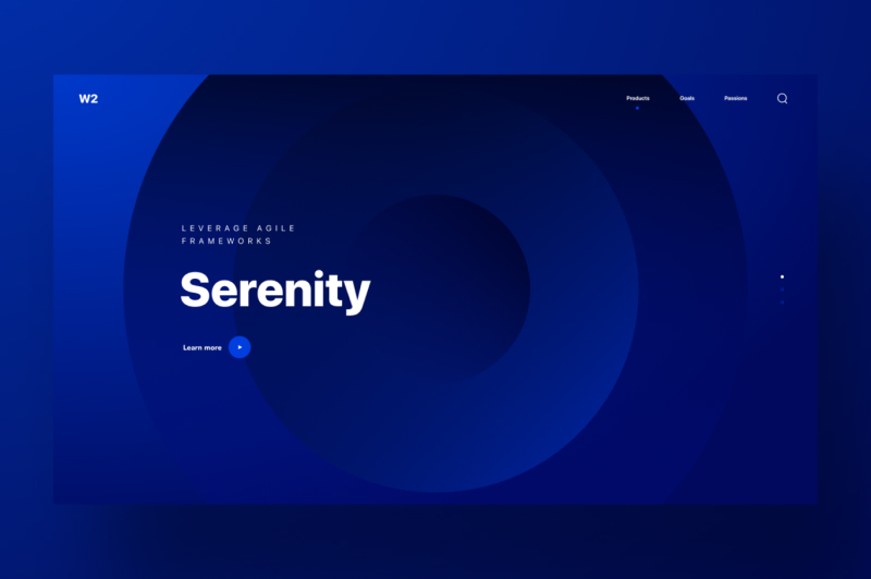
Gradients are also probably the easiest to mess up. The most important aspect of gradients is the colour combination. You cannot just mix any colours up hoping it would look good. As a rule of thumb, gradients of the same colour (for example different shades of blue) or of colours lying next to each other in the colour spectrum work well. Gradients also convey a range of emotions, influenced by proper colour choices. Soft blue can be used to induce a sense of peace where as a nice orange to yellow gradient can stir positive feelings.
3. Use of 3D Elements
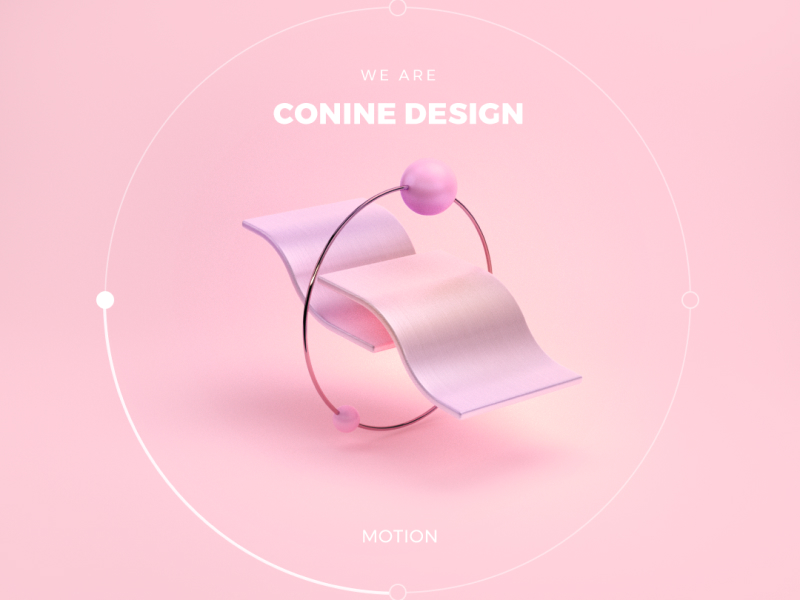
Although 3D elements were a cool design concept for a long time, they never took off in the practical world due to technical limitations on a wide range of devices, as they dumped a heavy load on the end users’ machines. With modern front end frameworks, technologies and libraries significantly reducing page load times, 3D designs have gained major traction as they won’t be crippling your users’ devices.
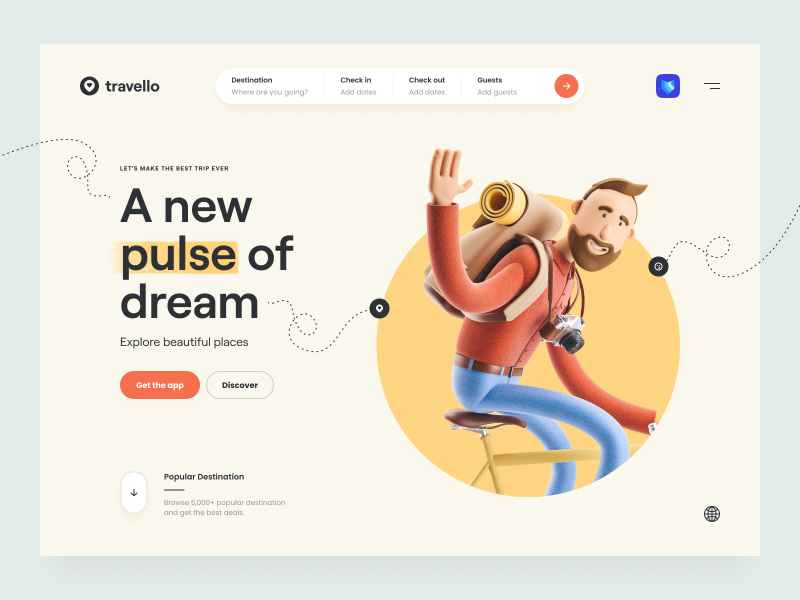
3D elements are generally placed in the hero section of a website, being the primal attraction piece of the website. They are often coupled with animations or parallax effects where the 3D elements change positions according to different interactions done by the user such as scrolling or mouse pointer movements. However, too many animations of 3D objects could slow the entire website down, hence, keeping 3D animations and elements minimal and effective is key.
4. Colourless Design with 2D Artworks
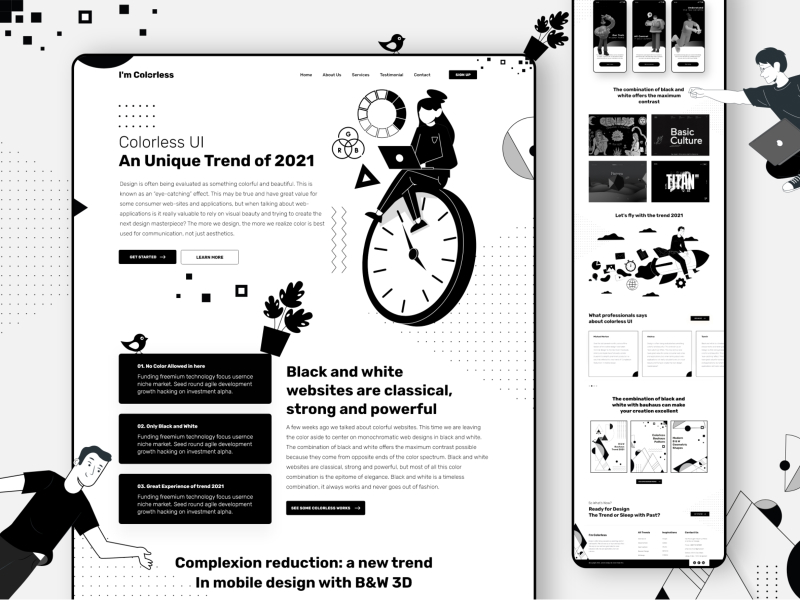
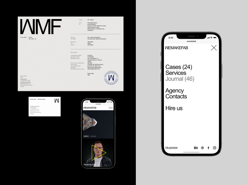
Going quite the opposite direction from all other trends, Colourless UI deals with a monochromatic design, having only black and white colours in the complete UI. This bold design philosophy gives room for plenty of creative 2D artworks to be used in the UI, and gives designers plenty of wiggle room to create an impact with powerful typography and positioning of elements in the screen.
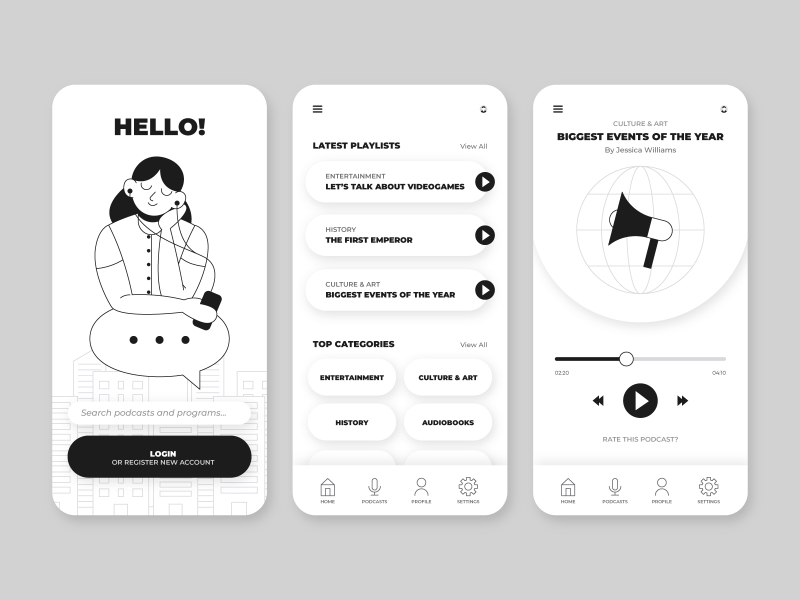
This design is effective just because of how different it is from the rest of the bunch and is a breather among an array of seemingly complicated UI designs with a lot of elements; which are always in trend. Colourless designs work best for content heavy websites as it gives a reminiscing feeling of having a newspaper open in front of the user.
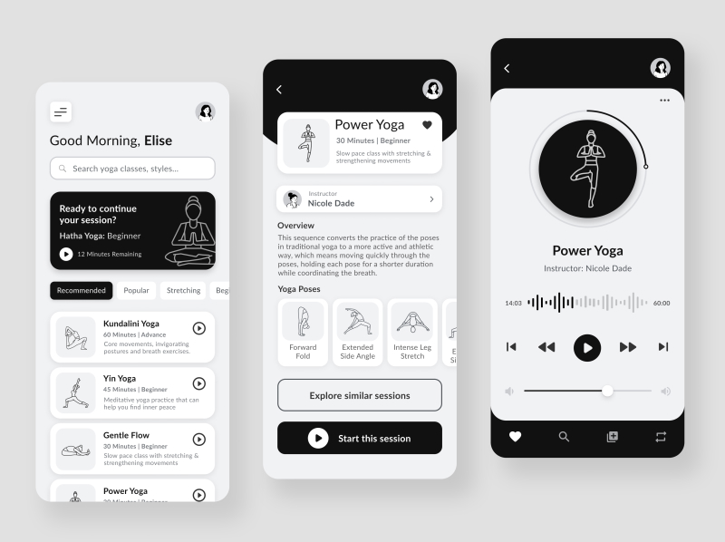
However, colourless UI can be a bad idea for product or e-commerce websites, as the lack of colour could be a big restricting factor for proper representation of their key products; going against the key utility of the website/app.
5. Complex Typography
Typography has always been a cornerstone in UI design since time immemorial. However, in recent times, websites are increasingly using typography as their main and sometimes their only focus on the entire website.
Although images and illustrations theoretically can convey a lot of information without the use of a single word; typography gives a much clearer picture of the information that is being conveyed. The clarity of textual data along with the cosmetic factor of using the correct typeface, size, spacing and many other typographical factors convey a much clearer message in the user’s minds.
There has been a rise in bold websites where the only content is text and such websites need careful thought surrounding it as it can easily be ruined or worse: misinterpreted by the users. Also, these designs work only if your target audience are not easily disinterested by having no images.
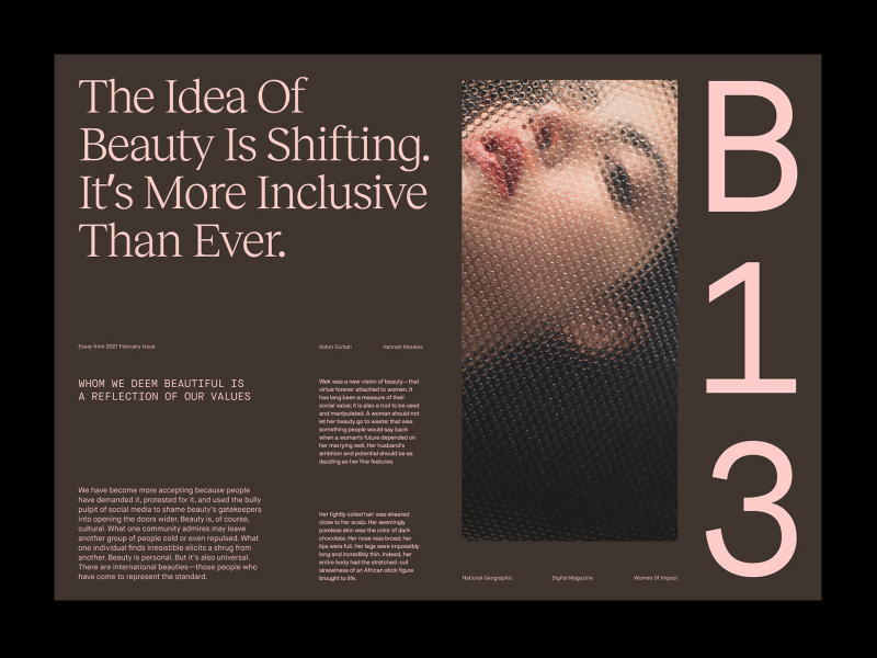
One of the key advantages of using typography UI is easy establishment of content hierarchy. More important information of the website can be highlighted using a bigger typeface, and the hierarchy can also be controlled using the text position. For example, in the design mentioned below, there are 4 different hierarchies, highlighted by the typeface and the font size.
6. Dark Mode
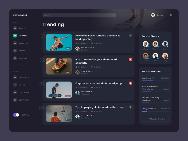
Dark Mode began as an accessibility feature, becoming essential in terms of reducing eye strain and increasing the device’s screen on time, as the pixels showing the dark (black) colour do not light up in an OLED or an AMOLED screen. With quality OLED displays getting cheaper, and cheaper OLED displays getting better, Dark Mode quickly gained traction and was adopted by major (if not all) operating systems from mobile to desktop. With more than 80% of users from a niche survey group using dark mode (according to this article on Medium), it’s no secret that Dark Mode is sometimes the only mode your user’s OS will be in, while using your application/website. So it’s only fitting that this design trend is all in the rage and will be a permanent design feature for any project.
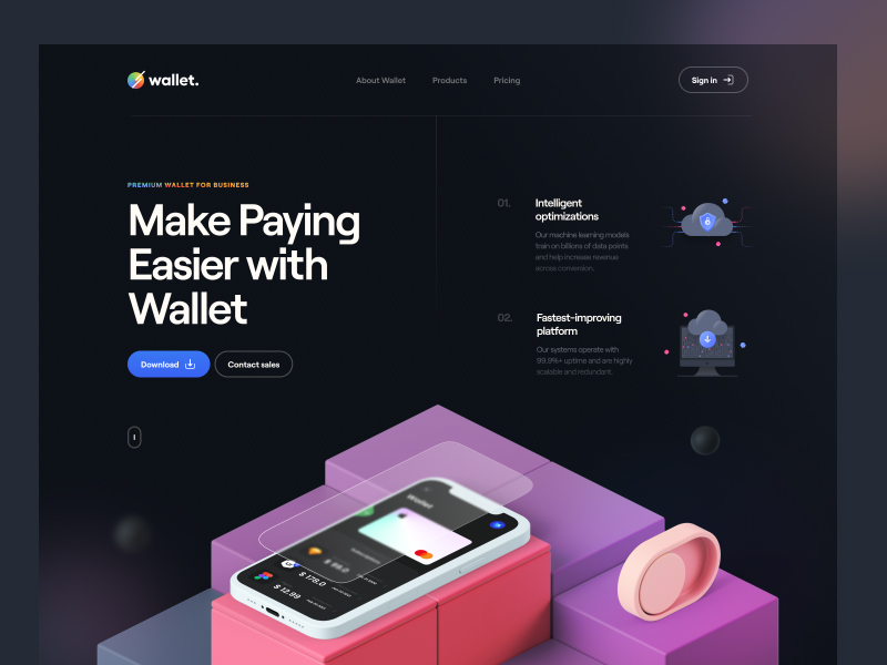
The key distinguishing factor of such designs is that the basic background colour in the UI will be black with other objects having a shade of black. More and more applications have both, a light mode and dark mode, often changing between them according to the mode the operating system is in. This gives a sense of continuity to the user from switching from the OS controlled screens to your application, increasing usability and adoption rates of your app. This means that UI designers will have to design their products for both, light and dark modes.
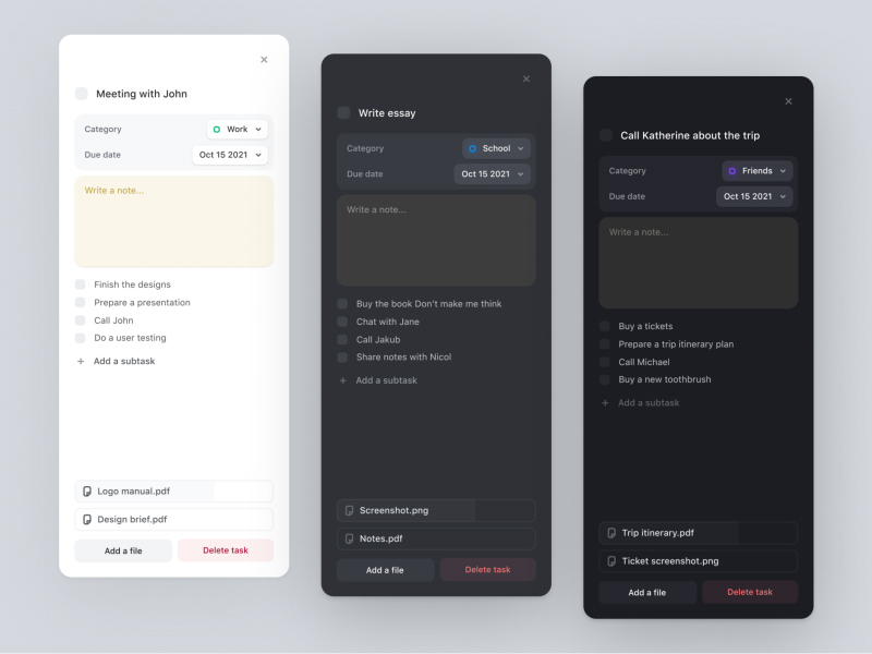
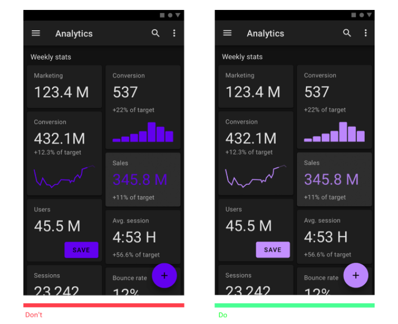
That said, there can be many factors that make a Dark Mode design not look good. For example, using a drop shadow on your elements in dark mode will generally make them blurry and won’t have the same effect as it does on a light background. Similarly, as shown in the image below, using saturated colours in dark mode is a bad idea as it will reduce the legibility of the text in your screen.
7. Micro Interactions
Micro interactions are an exciting new addition to the design trends. Whenever we as humans interact with something, be it clicking a button or swiping a notification, we expect the device to reciprocate, to react and give feedback that our actions have been registered and comprehended by the application. Micro interactions are just that. A short animated visual feedback generally shown when you interact with certain elements of the UI.
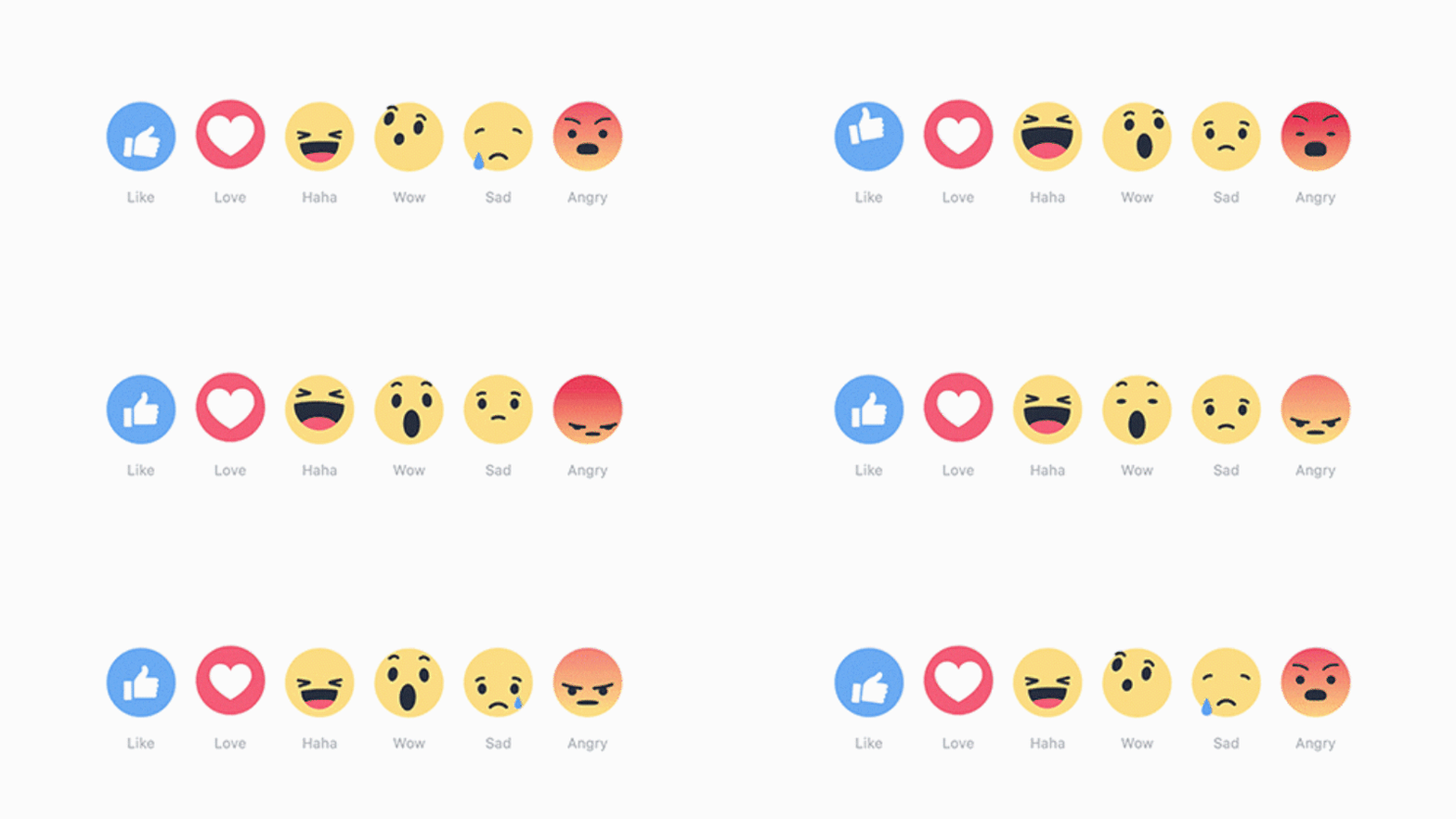
Some of the examples of micro interactions are:
- The refresh animation when you pull down on an app screen such as Instagram or Twitter
- Interactive progress bar while uploading files on applications such as WhatsApp or Slack
- The drag and drop animation while uploading a video or file on platforms such as Google Drive or YouTube Studio
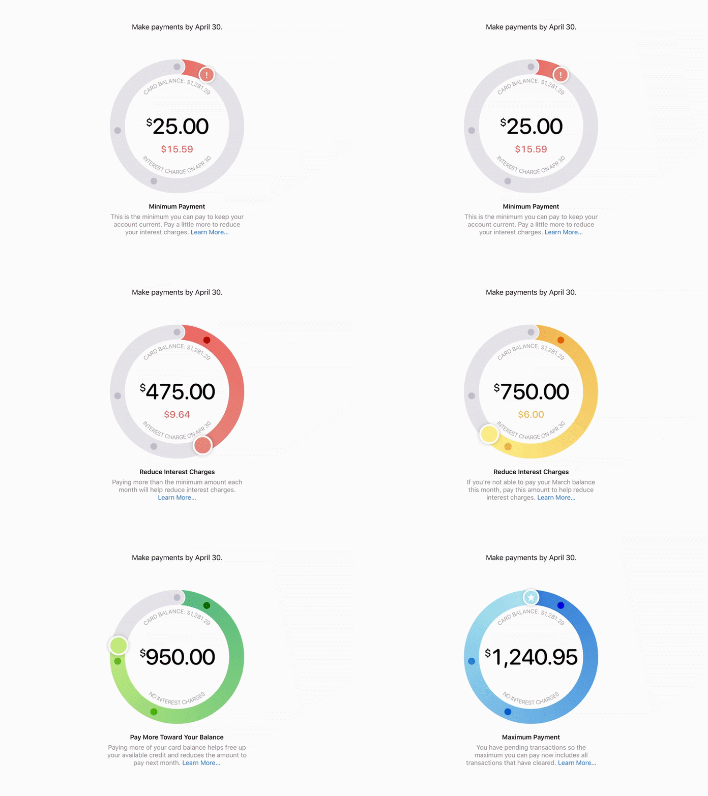
Micro interactions can also be used to lucidly show the users something that would be complicated if shown via text or images. A nice example of this would be the way Apple Card shows the interest charges on your credit card. This can be a complicated thing to tell your users, but Apple nails it with these microinteractions wherein the circular slider turns from a red to yellow to green showing the interest that would be charged if the user decided to pay x amount of their credit card bill.
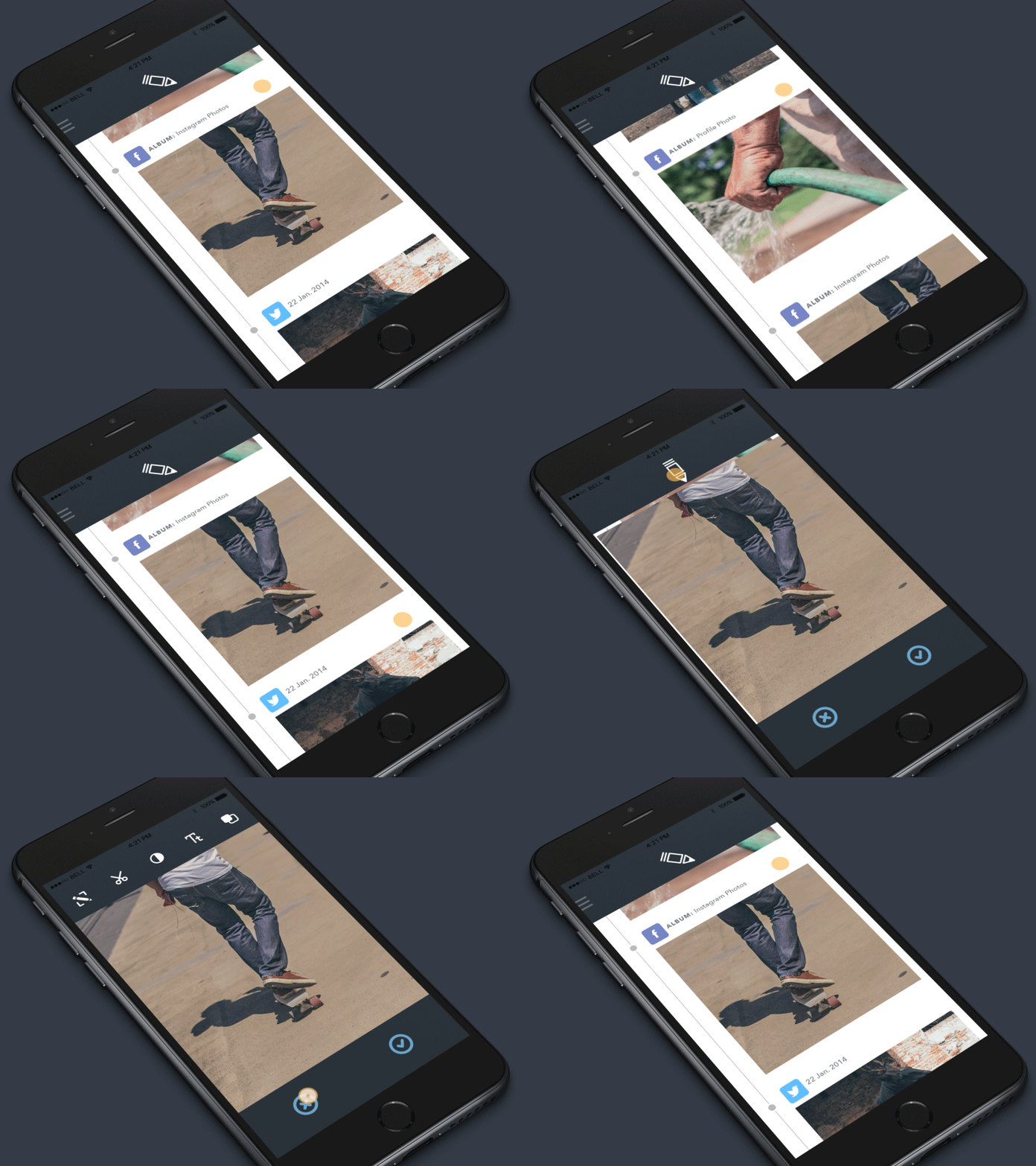
That said, there can be ways where this trend can be butchered; and using complicated animations and overusing them is at the forefront of that. For example, in the design below, almost all the actions performed by the user have bold and ‘in your face’ type of microinteractions and just because a lot of them happen at the same time which aren’t in the same visual hierarchy, (like the animation at the header and the footer of the screen when the user expands an image) they most often than not get in the way of navigation
A lot of the examples above state that quality UI designs are the ones that do not stick to a single design trend, but utilize multiple design trends by carefully understanding their audience to know which trends do and do not work for them. There are few design trends that are objectively good or bad, but there definitely are many designs that are bad for a specific use case and specific user group. Context is all that matters in UI design.
As mentioned in the beginning of this article, there can be hundreds of design trends that seemingly would take the entire UI world by storm and be the new norm, but fail to do so. We at Creole Studios are obviously not design prophets but if we had to take a safe bet, we’d stack our chips for Glassmorphism UI and Dark Mode UI. The fact that big giants have taken it into their own flagship products cement these trends and ensure that they’re here to stay. Here’s to more exciting UI trends in the months and years to come!








 30 mins free Consulting
 7 min read
 Singapore
 Finland


 Love we get from the world