

 Lets Talk
In today’s day and age, where the number of mobile users has surpassed desktop users by leaps and bounds, it is just not enough to have a mobile-responsive website. You need to further optimize your WordPress website for mobile.
Let’s take a deeper look into how you can optimize and speed up your WordPress website for mobile users.
Did you know that 48.7% of the total web visits are coming from mobile web browsing? Today, an average user spends x hours on mobile and if your WordPress site isn’t mobile-friendly, you could lose potential customers. In fact, Google has also confirmed that websites should be mobile-optimized to reap the benefits of search engine rankings. Hence, you need to understand how to optimize the website mobile-friendly to enjoy the benefits.

Why do you need a mobile-friendly website?
Technology has evolved tremendously since we first started experimenting with what we could achieve on a small phone’s screen, in the last ten years. With mobile traffic contributing to more than 50% of all global online traffic these days, it’s natural to conclude that your potential client’s first interaction with your brand will be on a smartphone.
Hence, mobile optimization, which makes a website mobile-friendly, could be the most critical factor in making your business successful.
How to check if your WordPress Site is mobile-friendly?
This step should be pretty straightforward and simple. Use any smartphone to visit your website and observe. If the site is sluggish, text or elements are incomprehensible, or page elements aren’t appearing, then your website most likely doesn’t have mobile WordPress optimization.
To be sure, you can use Google Mobile-Friendly Test on a browser, type in the URL of your website, and click Analyze. It will inform you whether or not your website is mobile-friendly after a quick summary.
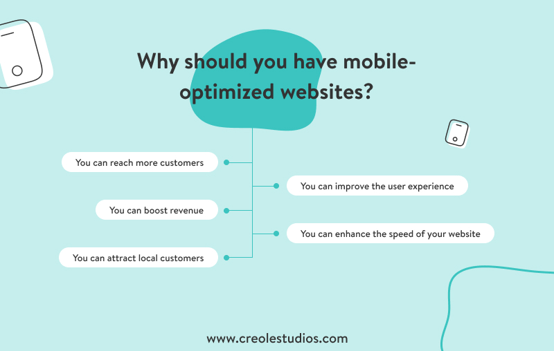
Why make your WordPress site mobile-friendly?
Having discussed why mobile traffic matters so much, here are more reasons why you should consider making your WordPress website mobile friendly.
- Search engines
Mobile responsiveness is one of the contributing factors in having your websites rank well among the search engines such as Google. With a huge chunk of new customers flowing in through search engine results, it is one of the vital factors that your site ranks well in search engine results, and making your website mobile responsive is a step in the right direction. Hence, optimize WordPress for mobile and boost search engine performance.
- Accessibility and display
On small screens and tablets, a mobile-friendly WordPress website appears superior. If your site isn’t mobile-friendly, visitors are more likely to abandon it right away, increasing the bounce rate of your website.
- Usage
Users’ attention is the most valuable asset in today’s world. You get that by being visible in places where users already are present. With more than half of the global online traffic coming from mobile devices, you have to have your WordPress website optimized for mobile to target a large chunk of your audience and not become obsolete.
Ways to improve WordPress website speed for mobile users!
Now that we know the importance of mobile traffic let’s find out simple ways to enhance and improve your website for mobile usage. Check this blog to get an idea of how to improve your WordPress website speed in general.
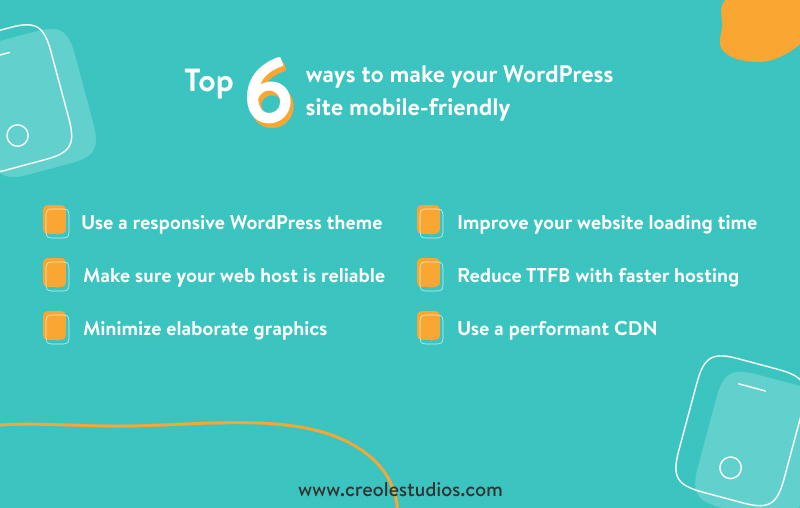
- Use a responsive WordPress theme
Responsive themes can adjust to the screen resolution they’re presented on. They adapt effectively to various screen sizes and configurations to maintain legibility and the desired aesthetic. You can read more about how to choose a WordPress theme. Because modern smartphones are almost prepared to supplant desktops in daily use, a responsive theme must be one of your top choices for mobile optimization.
- Make sure your web host is reliable
Most of your site’s mobile optimization efforts will be for naught if you choose an unsuitable web host. If you’re operating a new site, you must avoid pooled hosting services because it can lead to inefficiency in your website if another pooled website suffers a massive traffic spike.
WordPress hosting typically provides beneficial add-on solutions to help your website run smoothly. Your bundle typically includes default configuration, a membership to a WordPress mobile theme or plugin, a one-click setup, and other features. Keep in mind that these products are often included in the price.
- Minimize elaborate graphics
Consider the pixel density of a smartphone. Admittedly, they appear to be growing in size by the day, but they’re still considerably lower than the original PC. Forget about cramming your website with flashy visuals; doing so will only raise load times, which is poor for mobile optimization.
According to a Google DoubleClick study, more than 53% of consumers abandon websites that take longer than three seconds to load.
As a result, responsive design becomes a vital step in ensuring that your site is fast for mobile users. From version 4.4, WordPress has taken care of this by serving up the lowest feasible pixel accessible on your server.
- Improve your website loading time
Nobody prefers to linger in this rapid world, particularly your customers. People may press the back button if your site takes too long to load. This raises your bounce rate, and Google will ultimately penalize you by lowering your rank. Lower rankings imply fewer visits, sales, and revenues, among other things.
A poorly coded theme or many plugins might force your website to decelerate and load slowly, which is a typical concern among WordPress users. Website owners can analyze their site page speed with the help of the Google Page Insight tool. Check out these articles on how to improve the speed of your WordPress website and how to scale up your WordPress website to handle high traffic.
- Reduce TTFB with Faster Hosting
It’s necessary to keep your WordPress site’s TTFB (time to the first byte) low in hopes of keeping it performing well and avoid users clicking away. The time it takes for a user’s browser to get the first byte of data from your website is known as TTFB. It’s also a way to debug a slow website by seeing how quickly it loads in a specific region or with different settings.
TTFB is divided into three sections:
- The time it takes to send an HTTP request
- The duration of the connection
- The time it takes to download the first byte of a website.
- Use a Performant CDN
A CDN (Content Delivery Network) is a network of servers located all across the world. If you use CDN for your WordPress website, users visiting your website will receive the files to render your website on their browsers/applications from their nearest CDN node, reducing the load time for your website in general, and also your hosting bandwidth cost.
Get your free software development cost estimation now!
- Enable Google Accelerated Mobile Pages (AMP) in WordPress
Google is a firm believer in providing a faultless user experience, whether on a PC or a mobile device. They created Accelerated Mobile Pages (AMP), which aids in creating a mobile-friendly website by making web pages run better on mobile devices. Because PageSpeed is a ranking criterion in Google, and AMP speeds up web pages for mobile devices. As a result, it is accurate to say that AMP aids your website’s SERP ranking.
- Always optimize with mobile-first in mind
A mobile-first website is now more essential than ever for offering a higher quality product and boosting search rankings. Remember that WordPress optimization begins with its feasibility on the smartphone. People are more inclined to leave your site if it is slow. It is easier to build a mobile-friendly website and optimize it by prioritizing the smartphone audience.

- Use plugins for Mobile-Optimized content
By selecting a mobile-friendly WordPress theme, you may lay the groundwork for a mobile-friendly website. Then, using WordPress plugins for mobile optimization, you may build on that. However, there have been debates surrounding the security of WordPress plugins because WordPress Plugins are potential sources of security breaches.
Read More: Are WordPress Plugins safe to use?
- Avoid the use of full-screen pop-ups
Full-screen pop-ups with a statement of intent for your business can be an effective approach to attracting desktop users. However, mobile users may find these pop-ups intrusive. One explanation for this could be that these full-screen pop-ups aren’t intended for mobile devices.
This can easily be combated by writing a short piece of JavaScript code to recognize the user’s browser and prevent pop-ups from appearing, and straightening out the look using CSS.
- Test before committing
Ensure that the website you build is truly mobile-optimized before you send the word out. You can use one of the tools mentioned above, try your website on a smartphone yourself or use a dedicated quality assurance team to have automated testing of your WordPress website.
- Track your progress
A WordPress Website development firm can assist you in increasing mobile traffic, and Google Analytics can be used to analyze the website performance. Your efforts must be in the correct direction.

Conclusion
Smartphone usage has increased, so you must focus on mobile-responsive websites. The above-mentioned are the factors that you can perform to make your WordPress website mobile-friendly.
Having a mobile-optimized website will help you rank your website on search engines and boost traffic. If you want your WordPress website to optimize for mobile, Creole Studios can help. We have dedicated WordPress developers who can help you optimize your website and make it responsive.


 30 mins free Consulting
 10 min read

 Canada
 USA
USA 


 Love we get from the world