

 Lets Talk
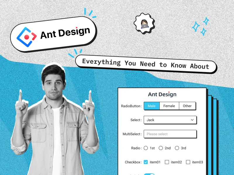
Quick Summary:
The Ant Design Select component is a powerful dropdown selector for ReactJS applications, offering advanced features such as searchability, multiple selection, and dynamic loading. This blog explores its key functionalities, customization options, and best practices for integrating it seamlessly into your projects. Whether you’re building enterprise applications or user-friendly interfaces, understanding how to optimize the Select component can significantly enhance your ReactJS development workflow.
Introduction:
When developing modern web applications, creating an intuitive and efficient user interface is crucial. ReactJS, one of the most popular front-end frameworks, offers various UI libraries to streamline development, and Ant Design stands out as a robust solution for building professional-grade applications.
As a ReactJS development company, ensuring seamless UI/UX is a top priority. Ant Design’s Select component simplifies dropdown handling with powerful features like search, tagging, and virtual scrolling, making it a go-to choice for scalable React applications. This blog dives into how you can leverage the Ant Design Select component to enhance your app’s interactivity, customization, and performance.
Benefits
- Ecosystem Integration: Ant Design Select fits seamlessly into the larger Ant Design ecosystem. It integrates effortlessly with components like Forms, Tables, and Modals, enabling developers to create consistent and cohesive user interfaces without additional configuration.
- Out-of-the-Box Features: This component is pre-styled according to Ant Design’s professional design system. It includes advanced features such as option grouping, virtual scrolling for performance optimization, and custom dropdown rendering, all readily available without extensive customization.
- Accessibility: Accessibility is a cornerstone of Ant Design Select, with strong support for ARIA standards and robust keyboard navigation. This ensures that applications built with Ant Design are usable by a wide range of users, including those relying on assistive technologies.
- Time-Saving: With its pre-configured styling and rich feature set, Ant Design Select significantly reduces development time. Developers can focus on core functionality rather than building dropdown components from scratch, making it an efficient choice for enterprise-level projects.
Features
- Single & Multiple Selection – Supports both single and multi-select modes for flexibility in data selection.
- Searchable Dropdown – Allows users to filter options dynamically using a built-in search input.
- Async Data Loading – Supports fetching options dynamically from APIs, making it ideal for large datasets.
- Grouping Options – Organize related options under different categories for better usability.
- Virtual Scrolling – Efficiently renders large lists with optimized performance.
- Custom Option Rendering – Allows customizing the display of dropdown items using custom renderers.
- Tag Mode – Enables users to input custom values and display them as tags.
- Disabled & Read-Only States – Supports disabling specific options or the entire component.
- Clear & Reset Options – Provides a clear button to reset selections easily.
- Keyboard Navigation – Fully accessible with arrow key navigation and enter selection.
- ARIA Compliance – Built with accessibility in mind, ensuring usability for all users.
Challenges
Ant Design Select is a part of the Ant Design UI framework. While it’s feature-rich, it has its own challenges:
1. Dependency on Ant Design
- Challenge: Ant Design Select is tightly coupled with the Ant Design ecosystem.
- Why It’s a Problem: Using it in a project not based on Ant Design might lead to inconsistent design or unnecessary dependencies.
- Example: If the rest of the project uses a custom design system, integrating Ant Design Select may force you to import the entire Ant Design library, adding extra bundle size.
2. Customization Limitations
- Challenge: While Ant Design allows theme overrides via Less variables or CSS, deep customization (like altering specific dropdown styles or animations) often requires custom CSS or writing overrides.
- Why It’s a Problem: This creates a steep learning curve for developers unfamiliar with Ant Design’s theming or Less.
Example: Changing the dropdown arrow’s appearance may require inspecting the DOM to locate and override specific styles.
@dropdown-arrow-color: #007bff;
@dropdown-bg: #f4f4f4;
3. Learning Curve
- Challenge: Using Ant Design Select effectively requires:
- Understanding Ant Design’s design principles.
- Familiarity with its Less-based theming.
- Why It’s a Problem: For developers new to the framework, this can lead to slower development times or improper use of components.
- Example: Configuring the component for advanced use cases, such as tags or custom dropdown renderers, may require reading extensive documentation or experimenting with examples.
Case Study & Use Cases
1. Integration with Forms:
- Use Case: Build a registration form with country selection.
Code Example:
import { Form, Select } from 'antd';
const { Option } = Select;
const App = () => (
  <Form>
    <Form.Item label="Country" name="country">
      <Select placeholder="Select your country">
        <Option value="usa">USA</Option>
        <Option value="canada">Canada</Option>
        <Option value="uk">UK</Option>
      </Select>
    </Form.Item>
  </Form>
);
export default App;
2. Large Dataset Handling:
- Use Case: Optimize dropdown performance with virtual scrolling for large datasets.
Code Example:
import { Select } from 'antd';
const { Option } = Select;
const options = Array.from({ length: 10000 }, (_, i) => (
  <Option key={i} value={i}>{`Option ${i}`}</Option>
));
const App = () => (
  <Select
    showSearch
    virtual
    placeholder="Select an option"
    style={{ width: 300 }}
  >
    {options}
  </Select>
);
export default App;
3. Grouped Options:
- Use Case: Group dropdown options by categories for better user experience.
Code Example:
import { Select } from 'antd';
const { Option, OptGroup } = Select;
const App = () => (
  <Select placeholder="Select a city" style={{ width: 300 }}>
    <OptGroup label="USA">
      <Option value="newyork">New York</Option>
      <Option value="losangeles">Los Angeles</Option>
    </OptGroup>
    <OptGroup label="UK">
      <Option value="london">London</Option>
      <Option value="manchester">Manchester</Option>
    </OptGroup>
  </Select>
);
export default App;
Choosing the best library (Ant Design)
Ant Design Select provides robust functionality out of the box, making it ideal for feature-rich applications. Here are some examples to help you get started:
Ant Design also provides some different ui designs like modal, popup, alert, dropdown, drawer, message and many more…
Follow the Link : https://ant.design/components/overview
Why Use Ant Design Select?
- Ease of Integration: Built directly into the Ant Design system, it inherits consistent styles and behaviors.
- Rich Customization: Tailor dropdown appearance and functionality with extensive APIs.
- Accessibility: Ensures keyboard navigation and ARIA compliance for better usability.
- Performance: Virtual scrolling optimizes rendering for large datasets.
- Design Consistency: Matches Ant Design’s theme and grid system effortlessly.
When to Use?
- Creating forms with dropdowns for single or multiple selections.
- Building tagging systems where users can define custom values.
- Fetching and displaying options dynamically from APIs.
- Optimizing performance for large datasets in dropdowns.
- Organizing options into groups for structured presentation.
1. Basic Usage
A simple dropdown with predefined options:
Jsx Code
import React from 'react';
import { Select } from 'antd';
const { Option } = Select;
const App = () => (
  <Select style={{ width: 200 }} placeholder="Select an option">
    <Option value="option1">Option 1</Option>
    <Option value="option2">Option 2</Option>
    <Option value="option3">Option 3</Option>
  </Select>
);
export default App;
2. Grouped Options
Organize options into categories using OptGroup:
Jsx Code
import React from 'react';
import { Select } from 'antd';
const { Option, OptGroup } = Select;
const App = () => (
  <Select style={{ width: 200 }} placeholder="Grouped Options">
    <OptGroup label="Group 1">
      <Option value="1">Option 1</Option>
      <Option value="2">Option 2</Option>
    </OptGroup>
    <OptGroup label="Group 2">
      <Option value="3">Option 3</Option>
      <Option value="4">Option 4</Option>
    </OptGroup>
  </Select>
);
export default App;3. Multi-Select
Allow users to select multiple items:
Jsx Code
import React from 'react';
import { Select } from 'antd';
const { Option } = Select;
const App = () => (
  <Select mode="multiple" style={{ width: '100%' }} placeholder="Select items">
    <Option value="item1">Item 1</Option>
    <Option value="item2">Item 2</Option>
    <Option value="item3">Item 3</Option>
  </Select>
);
export default App;
4. Searchable Dropdown
Enable search functionality for easier navigation:
Jsx Code
import React from 'react';
import { Select } from 'antd';
const { Option } = Select;
const App = () => (
  <Select
    showSearch
    style={{ width: 200 }}
    placeholder="Search Options"
    optionFilterProp="children"
    filterOption={(input, option) =>
      option?.children.toLowerCase().includes(input.toLowerCase())
    }
  >
    <Option value="1">Option 1</Option>
    <Option value="2">Option 2</Option>
    <Option value="3">Option 3</Option>
  </Select>
);
export default App;
5. Virtualized Dropdown
Handle large datasets efficiently:
Jsx Code
import React from 'react';
import { Select } from 'antd';
const { Option } = Select;
const options = Array.from({ length: 1000 }, (_, i) => ({
  label: `Option ${i + 1}`,
  value: `${i + 1}`,
}));
const App = () => (
  <Select
    style={{ width: '100%' }}
    placeholder="Virtualized Dropdown"
    virtual
    options={options}
  />
);
export default App;
Antd Select Component documentation: https://ant.design/components/select
Antd Components documentation: https://ant.design/components/overview
How antd select component Installation?
To use the Select component from Ant Design, you need to install the Ant Design library and set it up in your React project.
Steps for Installation
1. Install Ant Design
Use your preferred package manager to install Ant Design.
If you’re using npm:
npm install antdIf you’re using Yarn:
yarn add antd2. Install Additional Dependencies (Optional)
For styles:
Ant Design uses Less for styling. To customize themes, you may need to configure your project to support Less.
If you want to use Less, install it:
npm install less less-loader3. Import the Select Component
In your React components, import the Select component and Ant Design styles.
Basic Import:
import React from 'react';
import { Select } from 'antd';
import 'antd/dist/reset.css'; // Import Ant Design styles
Example Code:
import React from 'react';
import { Select } from 'antd';
const { Option } = Select;
const App = () => (
  <Select style={{ width: 200 }} placeholder="Select an option">
    <Option value="option1">Option 1</Option>
    <Option value="option2">Option 2</Option>
  </Select>
);
export default App;
4. (Optional) Customize Styles
To override Ant Design styles, you can configure Less variables. This requires setting up less-loader in your Webpack configuration or using a framework that supports custom theming, like Next.js or Create React App with craco.
- Ant Design with Create React App (CRA)
If you’re using Create React App:
Install dependencies:
npm install antd
npm install react-app-rewired customize-cra less less-loader
//* Modify the package.json scripts: *//
"start": "react-app-rewired start",
"build": "react-app-rewired build",
"test": "react-app-rewired test",
Create a config-overrides.js file in the root directory:
const { override, fixBabelImports, addLessLoader } = require('customize-cra');
module.exports = override(
  fixBabelImports('import', {
    libraryName: 'antd',
    libraryDirectory: 'es',
    style: true, // Enables importing Less files
  }),
  addLessLoader({
    lessOptions: {
      javascriptEnabled: true,
      modifyVars: { '@primary-color': '#1DA57A' }, // Customize theme
    },
  })
);
Start the development server:
npm start- Ant Design with Next.js
Install Ant Design:
yarn add antd
Import the component and styles in _app.js:
import 'antd/dist/reset.css'; // Import Ant Design styles
Conclusion
The Ant Design Select component is a versatile and feature-rich dropdown solution that enhances the user experience in ReactJS applications. With built-in search functionality, multi-select options, and extensive customization capabilities, it simplifies complex selection processes and improves application efficiency.
For businesses looking to build high-performance web applications with intuitive UI components, leveraging the right tools and expertise is essential. If you’re planning to implement advanced UI elements in your projects, it’s beneficial to hire ReactJS developers who have hands-on experience with Ant Design and other modern UI libraries. Expert developers can help you optimize performance, ensure seamless integration, and deliver a polished user experience tailored to your business needs.
FAQs
1. Is Ant Design Select accessible?
Yes, it is ARIA-compliant with strong keyboard navigation support.
2. Can Ant Design Select be used outside Ant Design projects?
While technically possible, it’s not recommended due to dependency on Ant Design styles and ecosystem.
3. How do I use multi-select with Ant Design Select?
To allow multi-selection, set the mode prop to multiple:
Jsx Code Example:
<Select mode="multiple" style={{ width: 300 }} placeholder="Select items"> <Select.Option value="item1">Item 1</Select.Option>
<Select.Option value="item2">Item 2</Select.Option>
<Select.Option value="item3">Item 3</Select.Option>
</Select>
4. Does Ant Design Select support virtual scrolling?
Yes, Ant Design Select supports virtual scrolling for efficiently rendering large datasets. To enable it, simply use the virtual prop when rendering large lists:
Jsx Code Example:
<Select virtual style={{ width: 300 }} placeholder="Select items">
{/* options go here */}
</Select>


 10 min read


